WYE VALLEY BREWERY KEG STOUT REBRAND: NIGHTJAR
Creating a Stand Out Stout:
A new brand identify that can compete in a saturated market.
Wonderworks were briefed to develop a new brand identity for Wye Valley Brewery’s Keg Stout (previously name Wholesome Stout) to support its relaunch in September 2022. With an end goal of establishing Wye Valley Brewery’s Keg Stout as a strong competitor to leading stout brands, we explored different creative routes for its new brand identity, to give it its own standing in the world of stout. Once a creative route for the new identity was selected, we then further refined the concept with brand guidelines and assets.
Brand Identity Redesign | Brand Guidelines | Brand Assets
THE CHALLENGE
Today’s beer drinkers are faced with an overwhelming array of options when it comes to choosing which pint to pick upon entering the on-premise. It becomes difficult for smaller breweries to compete with the big players such as Diageo, Molson Coors & Heineken, when these brands have often been around for longer, have bigger budgets to play with and are well established. Winning consumers’ attention is increasingly difficult.
In an evidently over-saturated market, and with the current cost of living crisis, consumers are choosing to vote with their purchasing choices, often putting their values where their money is. One way consumers are choosing to do this is by supporting local economies through ‘Shopping Local’ and ‘Buying British’.
Wye Valley Brewery’s Keg Stout’s new identity needed to capture the attention of the consumer to compete, whilst also communicating its British provenance.
THE INSIGHT
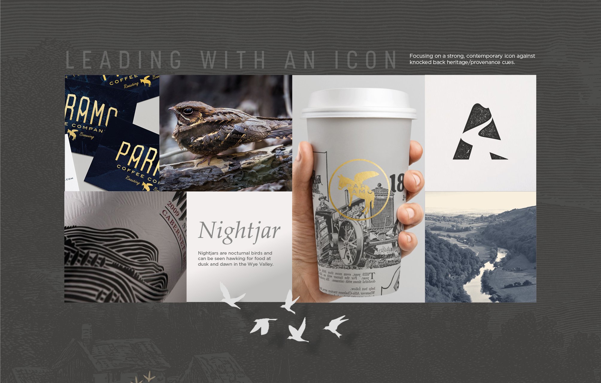
Wye Valley Brewery has been operating for decades and is well-known within the regions of the West Midlands and South Wales. The brewery’s British roots were something noted as desirable to the consumer audience. The name ‘Nightjar’ was chosen for the rebrand as they are nocturnal birds that reside in the Wye Valley in Hereforshire. This reflected the brewery’s heritage and stout’s dark colour. The new brand identity needed to communicate the brands routes, providing it with its own individual personality and identity.
However, due to the competitive market the new identity also needed to be automatically recognisable as a stout, working on the current consumer memory structures of what a stout brand is perceived to be.
DESIGN EXPLORATION & DEVELOPMENT
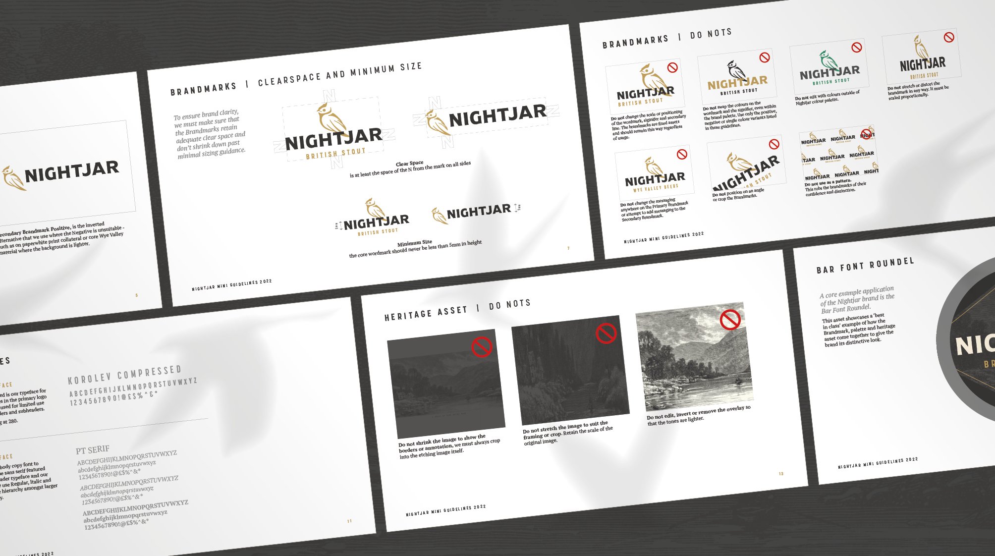
MINI BRAND GUIDELINES
THE APPROACH
The key for the design adaption was ensuring that Nightjar’s British heritage and local provenance was visually communicated, in a way that made it recognisable as a stout brand and a key consideration for consumers over competitors.
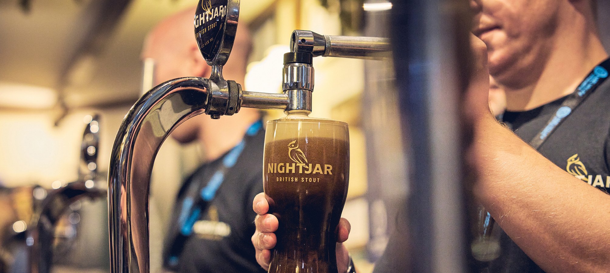
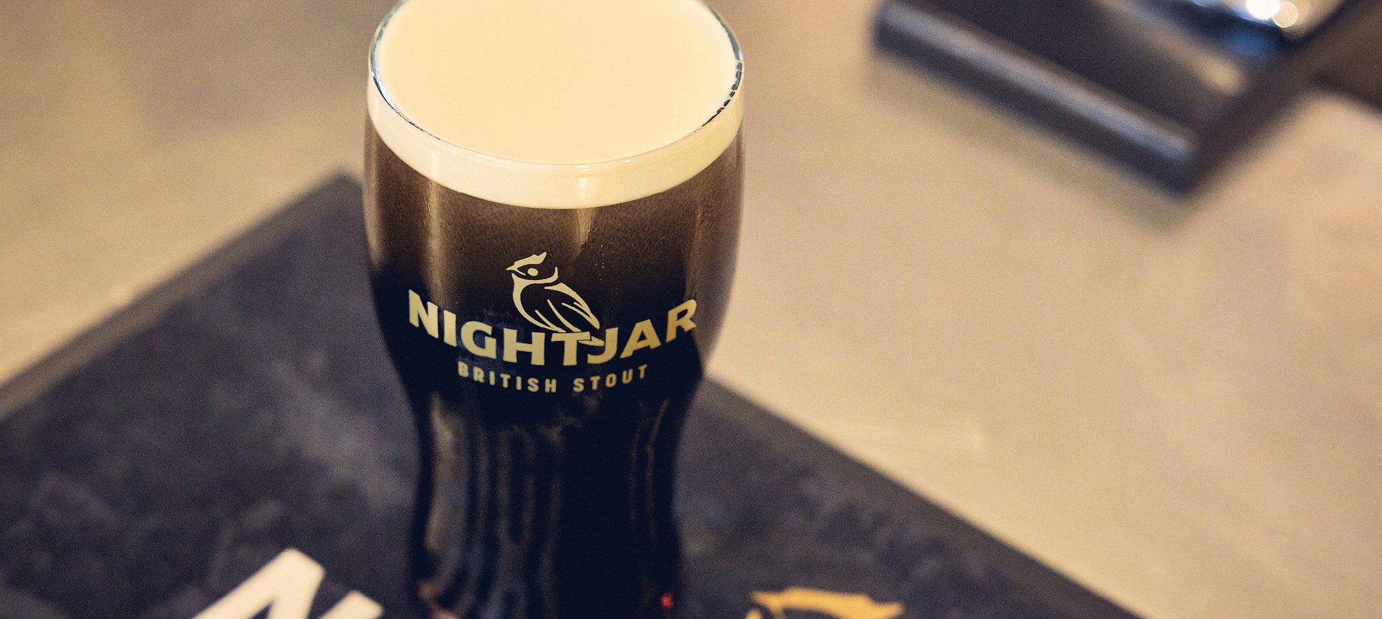
Incorporating a Nightjar bird signifier, background image of the River Wye, and a ‘British Stout’ messaging into the logo were all important elements to communicate the brand’s heritage. While a gold, black and white colour scheme was chosen to capture the attention of consumers with recognisable stout colour schemes.
THE WONDER
In a crowded marketplace chock-a-block with beer and stout brands, the new Nightjar branding allowed Nightjar to compete in a category currently dominated by Irish stout brands. By extenuating the brand’s British provenance, our rebrand informed consumers that Nightjar is a stout they can buy to support the local economy, whilst delivering outstanding taste and quality as good, if not better, than its competitors.
FOUNT BADGE | BAR MAT | COASTERS
The Results
Since launching Nightjar at its opening party to 250 on-trade customers, Wye Valley Brewery has experienced record sales month on month, seeing a 145% increase in sales of its Keg Stout. In addition, the brewery has tripled its number of permanent stockists since the brand changed its identity from Wholesome Stout to Nightjar.
The response from both the trade and consumers has also been impressive, with one licensee saying they “couldn’t believe that a name change had tripled sales overnight”, whilst another was able to convert his loyal Guinness customers to Nightjar.


